Composition and colors
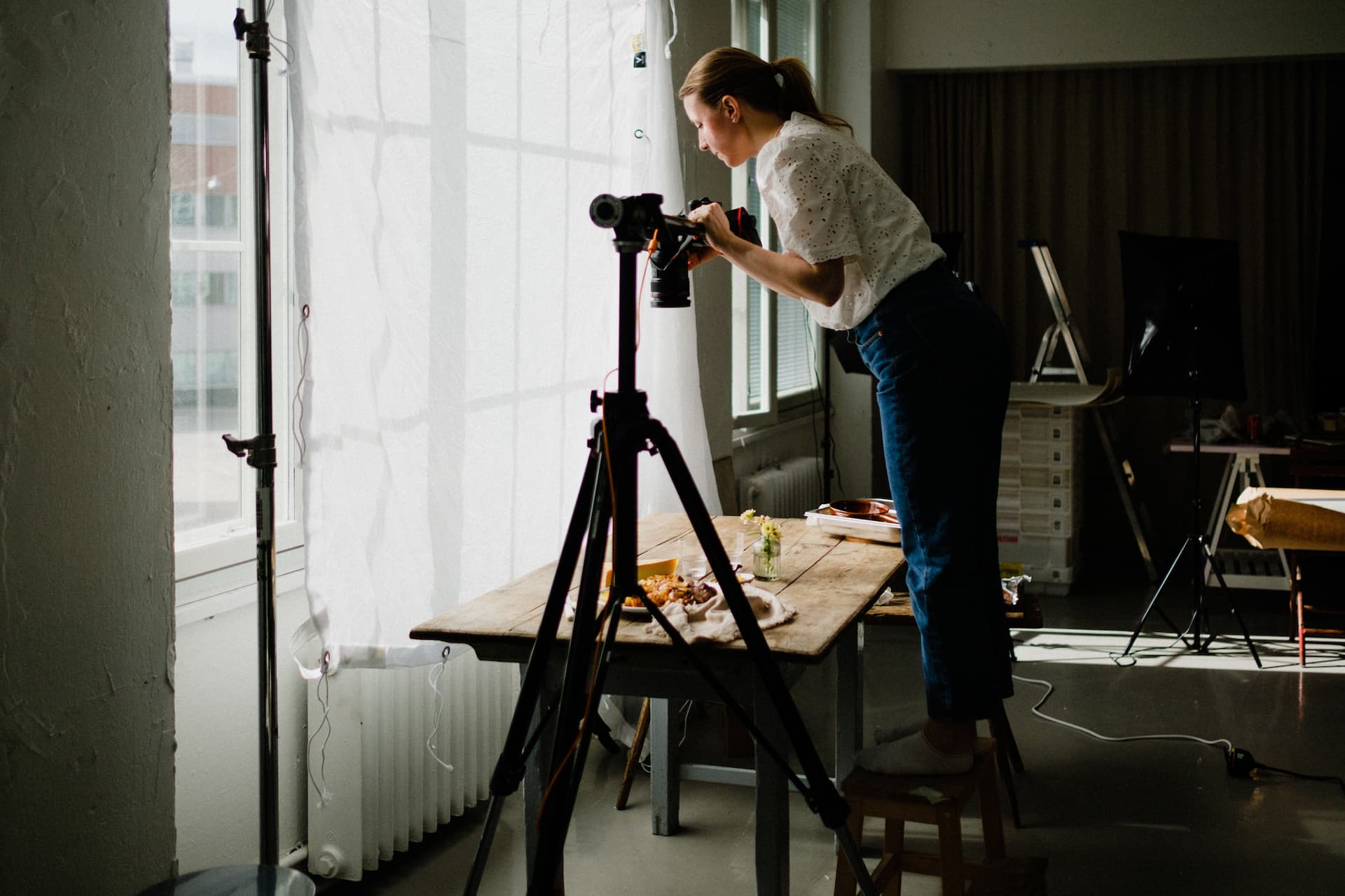
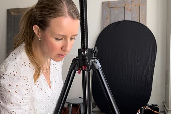
I love food photography because it gives me the chance to build the scene from scratch each time. It starts with an empty background and then I start building the image. The goal of a good composition in a food image is to tell the story we want the viewer to understand and feel.
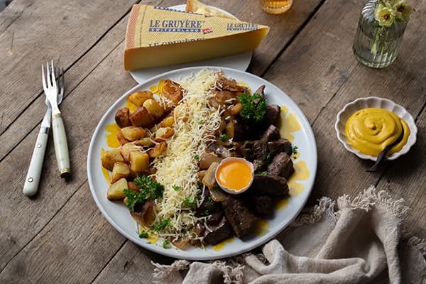
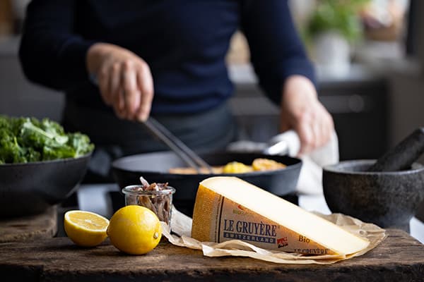
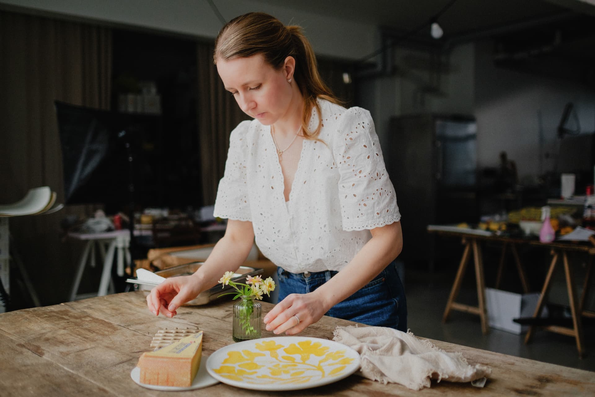
My aim is to make images look as natural and as balanced as possible. I also like to create a sense of depth. That can be achieved by layering and by overlapping different parts in the image. Layers can be achieved by using beautiful ceramics, linen, cutlery, wooden boards and flowers for example. If we are shooting overhead, some parts can be out of focus to add more depth. Also a very minimalistic image can have layers. Let’s say for example that we only have one salad plate in the image. Then we can think about the plate as one layer and add layers in the salad. A sprinkle of olive oil, fresh herbs and some pepper on top of the salad can really bring the image to life.
There are many compositional rules that can be applied to food photography. Usually we have the most important element, the hero, of the image. That is where we want to lead the viewer’s eyes and that can be achieved by a good composition. Often I start building the scene with my hero element and then add all other elements around it. We can think about lines and curves to make the image flow beautifully. I like to use odd numbers in my images. Of course there are exceptions but usually I add three, five or seven pieces of one item. Another way to create balance is to use negative space in the image. This can be very powerful and help to bring the most attention to the food.
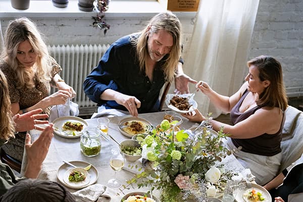
There is a lot of attention to detail when building a food scene.

Colors can be used to improve our food photography and I think it is important to think about colors while building a scene. Color theory is a broad subject, but I want to name a few tips here. We can think about the different moods and emotions colors evoke. Let’s start by examining the color wheel. If we pair complementary colors, like orange and blue for example, we can really make an orange dish pop by using a blue background or plate. For a calming feel we could use monochromatic colors.
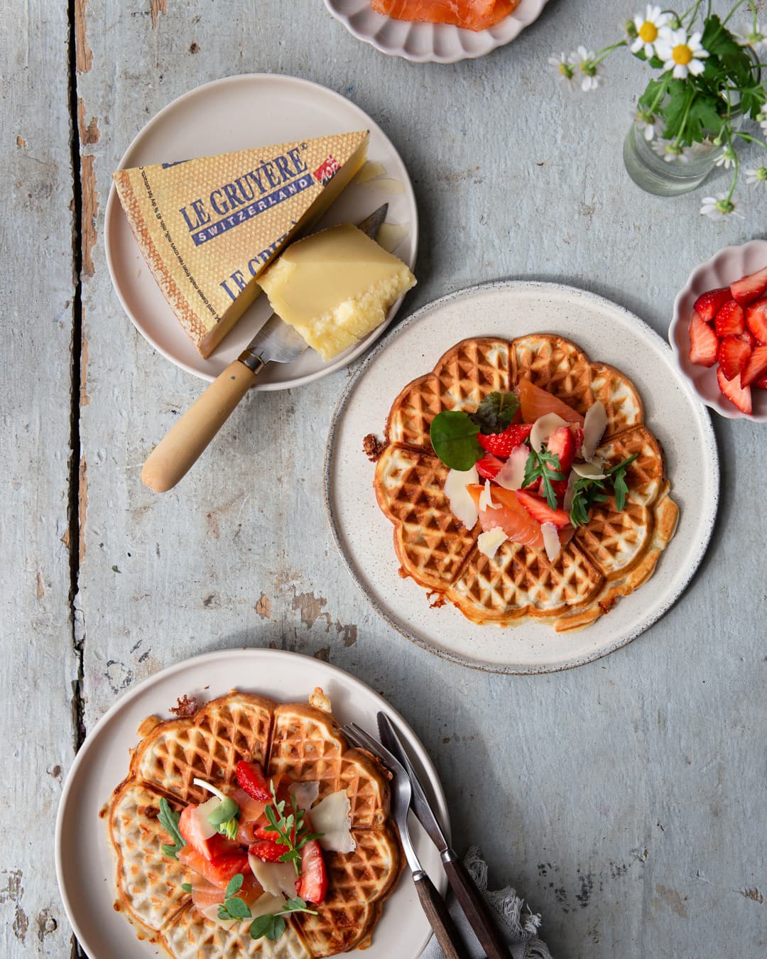
The waffles look great on a blueish background.
I often choose all my props in a similar color and style. I feel that calms and balances the image and helps to highlight the food, because the props are meant to be in the background and only support our food story. Also keep in mind that people tend to focus on the most brightest and most colorful elements in a frame. So this should be where we want to lead the viewer’s eyes. I often choose all my props in a similar color and style. I feel that calms and balances the image and helps to highlight the food, because the props are meant to be in the background and only support our food story. Also keep in mind that people tend to focus on the most brightest and most colorful elements in a frame. So this should be where we want to lead the viewer’s eyes.